Gray Area Rugs
-

 Sold out
from $49.85
Sold out
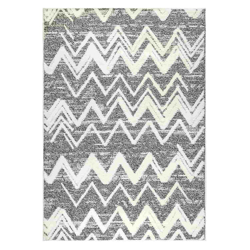
from $49.85Antep Rugs Palafito Geometric Shag Chevron High-Low Pile Textured Indoor Area Rug Perfect for Dining Room, Living Room, Bedroom. Spot clean with mi...
View full detailsfrom $49.85Sold out
It will come as no surprise to anyone who’s had internet access and even a passing interest in interior design or décor over the past few years that gray is the contemporary neutral of choice in interiors. Not only that, but the blend of black and white (and other colors in between; we’ll discuss this later on) will likely be around a long, long time. Perhaps this is partly due to the fact that, “gray is controlled and inconspicuous and is considered a color of compromise, perhaps because it sits between the extremes of black and white” – Sensational Color.
Although color trends in interior design are “frequently fickle, … for once, forecasters say that single hue has entrenched itself as the current and future favorite: gray” – Delta-optimist. In this article, we’re going to look at a variety of grays used in a variety of ways in interiors and discuss what makes it such a desirable and successful neutral.
Layers of Grey in Living room
Grey is a calm and soothing color; so calm that unless you add depth with layers, it could feel a bit dull. This Monsoon inspired living room uses textural effects in the rug, and boldly patterned cushions to add interest and vibrancy to the room. This is about as minimalistic as it gets, and we absolutely love the look.
Green And Grey Living Room
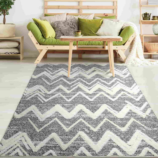
Green is the perfect foil for the soothing ambience provided by a theme that is predominantly grey, as it brings in the freshness of spring. This two-toned living room rug introduces elements of green in between the grey, for a charming, ‘put together’ touch. Note the way the designer has carefully accessorized plants and natural colored coffee tables.
Try Shades of Slate Grey
Slate grey is a shade that packs a punch and makes quite a definitive statement in this living room. The designer has used white accents on the wall unit and the earthy side table to bring in an element of serenity, paired with curated tree branches to reiterate the theme of nature. A lighter shade of grey is also introduced in the living room rug. It blends perfectly well with the bluish hue of the slate grey.
A Burst of Sunshine in Grey
Sunshine yellow adds a refreshing element of cheer in this grey living. One of the most popular combinations for a two-toned theme, a living room with silver area rug and yellow furnishing details is refreshingly lively and light. The wooden legs of the furniture add natural warmth to the natural warmth to the interior.
Bright Pops of Rainbow Colors
Grey is a balanced and firmly neutral color, which is why just about any bright color will contrast well with it. This lovely room uses bursts of solid candy colors as a contrast to the soft and relaxing grey color of the floors. The aztecesque patterns in eye-popping colors add dramatic interest to down below, while the navy recliner completes the look for a cozy feel.
Contrasts in Grey
A contemporary-industrial backyard designed in shades of grey, black and white, and the pool is what ties it all together with blue/grey color scheme, not overlapping with the dark grey rug. It’s always lovely to bring nature in, and the plants add some life to the area. The black metal legs of the furniture, the cornerless metal chair and the natural tone of the stones pull this smart casual look together.
Brown, Black and White (in all forms) in a Living Room
To add interest and depth to your scheme, play around with different shades of the same color. This silky off-white wall is smooth and subtle, except for the simple wood accent one side. Note that the pattern in monochromatic grey area rug is not replicated in the cushions on the grey sofa. The designer instead added a smoldering feel to the area by adding burgundy cushions and a musky coffee table.
Sometimes browsing through a catalog is not enough and we might feel like we have some questions and need some expert opinion. If you fall to this category, as so many of us do, look no further. Here is an excerpt of an interview with the renowned design expert and consultant Haren Kaller:
In recent months, we have witnessed the growing popularity of grey interiors. Why do you think that is?
There could be a number of reasons. It could be seen as trendy/fashionable or aspirational. This gives a sense of belonging, inclusion, acceptance. Or perhaps during these uncertain times we are currently in, people may be looking for security.
To what extent does the shade of grey that we choose to make a difference to our interiors?
It’s best to use the shade of grey that resonates with you. There are warm greys (yellow-based) and cool greys (blue-based).
Are there any areas of the home where the use of grey should be avoided?
Grey is best avoided in the bedroom, nurseries and any rooms for infants and children. It should also be avoided in any rooms that require creativity.
What colors would you say work particularly well in conjunction with grey and why?
As grey doesn’t have a ‘personality’ of its own, paired with any other color, it allows that color to be visible whilst grey takes a back seat. The key is to choose a grey that is from the same harmonious color family as the rest of the colors you are using. That way it will harmoniously resonate and not jar or drain the other colors.
Conclusion
Flooring is a critical ingredient in any interior project that can make a profound impression on the overall design. It’s vital therefore that you select the right carpet design no matter your project. Grey in general is famous for its adaptability to a variety of interior settings, whether by playing a major role in the room’s vibe, or as a trusty background for your other colors to take stage. We hope this guide has shown you what’s possible.
FAQs
You can either combine gray with other neutral colors such as black and white or use bright colors such as orange and yellow to create interesting contrasts.
Gray area rugs are certainly in style thanks to the transitional and modern design choices taking the spotlight in recent years.


